Thursday 10 June 2010

the.dude.abides


Is today the 10th already? Far out man....

“What are the requirements for transforming a book or movie into a cult object? The work must be loved, obviously, but this is not enough. It must provide a completely furnished world so that its fans can quote characters and episodes as if they were aspects of the fan’s private sectarian world, a world about which one can make up quizzes and play trivia games so that the adepts of the sect recognize through each other a shared expertise.”
- Umberto Eco in "Casablanca: Cult Movies and Intertextual Collage"


Wednesday 9 June 2010

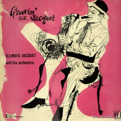
david.stone.martin - illinois.jaquet

David Stone Martin at his best! The second image is the original 1955 cover for Clef Records' “Groovin' with Jacquet”, and Verve wisely re-used it for their 1994 "Flying Home" compilation setting the drawing onto a damn pretty yellow.


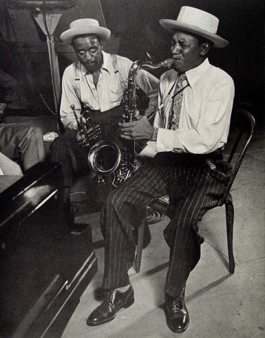
And here's some Illinois Jaquet.


mico.toledo


Mico Toledo is a graphic designer who loves typography and music. Combing those two loves, he has started a project entitled “Music Philosophy,” in which he creates a weekly visual interpretation of philosophical song.


These annoy me a little bit.... yet I find myself really liking them. As an exercise in typography they're damn successful. Particularly the Beatles poster above and the Moldy Peaches one with the hands... I think these work best when the passages don't rhyme (quoting songs in general work best sans rhyming, without the music rhymes sound thrice as cheesy).

Tuesday 8 June 2010

the.ibex.and.the.cheetah


Kate Toledo, during her time in Brazil was inspired by the richness of the Baroque art found in Brazilian churches and sacred art museums. Her work is heavily influenced by the colors and shapes of the afro-roman-catholic syncretism commonly found in the Brazilian hinterland. It is easy to recognize in Kate’s earlier work the influence of the “Festa do Divino” images, the rococo splendors in rich textures of gold, the purple and royal blue of the saints, mixed with the red and ochre of the “figas” and chicken blood from the “candomblĂ©.”

saudades


Monday 7 June 2010

tim. burton.minimal.posters


I think it's clear I have a little art envy when it comes to poster design. When done well, posters remind me of that moment in a book or story when you figure out what the title means. Much like good good trailers, a poster should let you know exactly what kind of film you're in for without giving away any plot. Good poster collections, such as this one, work as showcase for both the filmmaker and the designer's style. I also love it when posters only make sense once you've seen the film.

television.is.a.drug


If find this hypnotizing, amusing and terrifying in equal measure.


Television is a drug. from Beth Fulton on Vimeo.


“The inspiration of this video comes from Todd Alcott’s poem, Television. I own no rights to his reading of the poem and intend only to share my own personal interpretation. Hope you like!”

Followers